hparmar-dataviz-portfolio
| home page | data viz examples | Visualizing Government Debt | critique by design | final project I | final project II | final project III |
From Stability to Strain: How Rising Costs Are Outpacing Student Earnings
Storyboards
When I began this project, my initial goal was straightforward: I wanted to compare how much housing costs had changed over time. But after classroom feedback and the critique-by-design exercise, it became clear that the story wasn’t just about housing or inflation—it was about something deeper and more relatable. Students today are facing a widening financial gap where the cost of simply existing (rent, food, tuition) is rising much faster than what they earn.
This realization shifted the entire scope of the project. Instead of looking at isolated datasets, I expanded the analysis to include housing CPI, food CPI, tuition costs, and student earnings. Bringing these datasets together allowed me to tell a fuller, more honest story of the student financial reality today—one where budgets are tighter, trade-offs are harsher, and affordability is becoming increasingly out of reach.
The structure of the storyboard follows this progression:
Start with cost-of-living pressures — showing how basic necessities like housing have risen year after year.
Layer in tuition costs — revealing how education affordability has changed in the same timeframe.
Contrast both with student earnings — highlighting the imbalance between rising expenses and stagnant wage growth.
This narrative shift allowed me to move beyond simply describing what costs look like, and instead begin exploring why students feel more financially strained today, even compared with just ten years ago. It also helped uncover a core insight: the issue isn’t just inflation—it’s that income is not keeping pace.
Ultimately, this project is not only about numbers. It’s about understanding the student experience in a landscape where everything feels more expensive except the one thing students rely on the most: their paycheck. A chart about CPI becomes a chart about affordability. A line showing tuition becomes a line showing the trade-off between education and financial stress. And when viewed together, the story becomes clearer: today’s students are being financially outpaced by their environment.
I will use this storyboard as the foundation for my Part III draft in Shorthand, where I will refine the narrative, integrate the Tableau visualizations, and strengthen the overall flow and clarity.
Shorthand preview link: View my Shorthand story
The Introduction: Understanding the Rising Cost of Living for Students
The story begins with a simple but important question: How much more expensive has it become to be a student today?
I start with my Housing CPI Over Time visualization, which shows how housing costs have risen sharply from 2015 to 2024. The line isn’t just increasing — it accelerates noticeably after 2021. This chart establishes the foundation: essential living costs have been climbing steadily, and students today are entering a financial environment that is fundamentally more expensive than it was a decade ago.

From here, I layer in food-related cost pressures. My Food-at-Home CPI Trends visualization highlights the consistent rise in grocery expenses, reinforcing that students are feeling cost increases in every basic necessity — rent, meals, utilities, and daily living. Together, these charts show that the financial strain is not isolated; it’s systemic.

The Middle: Tuition Costs and the Financial Gap
After exploring how the cost of everyday essentials — housing and groceries — has risen sharply over the past decade, the story shifts to another major financial burden for young adults: the cost of higher education.
To understand how college affordability has changed, I use the Average Total Cost of Attendance for 4-Year Institutions dataset from NCES (Table 330.10). This metric includes tuition, mandatory fees, room, and board across all institution types: public, private nonprofit, and private for-profit colleges.
In my visualization, the upward pattern is unmistakable. From 2010 to 2023, the total cost of attending a 4-year college has risen every single year, increasing from roughly $22,000 to over $31,000 annually. Even during periods of slower inflation, education costs continued climbing steadily, outpacing wage growth for many families.
What’s important to note — and what surprised me as I worked with this dataset — is that these figures may look lower than typical tuition numbers people hear about in the news. This is because NCES reports a national weighted average across all four-year institutions, including large numbers of lower-cost public in-state universities. It does not represent the sticker price of individual private colleges, which is why the national average is significantly lower than many people expect.
Still, even this “smoothed-out” national average shows a clear trend: the cost of earning a degree continues to rise, adding yet another financial layer to the already-increasing costs of housing and food.
This section transitions the story from basic living costs to a more structural financial challenge: the growing gap between the cost of education and the financial stability young adults need to achieve it.

But rising tuition is only one side of the story. The other side is a student’s ability to pay for that education. Most full-time undergraduates work part-time — typically around 20 hours per week across a 35-week academic year. Using median weekly earnings for young workers from BLS data, I estimated how much a student can realistically earn in a year.
When we compare these earnings to the rising cost of attendance, the gap becomes strikingly clear: even a hardworking student with consistent part-time hours cannot keep pace with the increasing cost of college.
This financial gap is a core part of the modern student experience, and the visualization below makes that widening divide impossible to ignore.

The End: What These Rising Costs Mean for Young Adults Today
After looking at housing, groceries, tuition, and the widening financial gap, the final takeaway becomes clear:
Young adults today are entering adulthood facing higher baseline living costs than any recent generation. Housing — the largest monthly expense — has steadily climbed year after year. Groceries, once a stable category, spiked sharply after 2020 and remain elevated. And higher education, long viewed as the pathway to upward mobility, has become substantially more expensive while part-time student earnings have barely kept up.
In isolation, each chart tells a story of gradual increase. But together, they reveal something more powerful:
- Every major cost required to build a stable adult life is rising at the same time.
- These increases outpace what young people can earn while in school.
- This squeezes students academically, financially, and emotionally.
For many, this means taking on more loans, delaying milestones like moving out, or working longer hours — often at the cost of sleep, mental health, and academic performance. The data brings into focus the everyday reality behind headlines about affordability and “cost-of-living crises.”
But the story isn’t just about struggle — it’s about awareness.
By understanding where and how costs are rising, we can start conversations about support, policy, and systems that genuinely reflect the financial realities students face today.
User research
To refine my storyboard and ensure that my narrative communicates clearly to a non-technical audience, I conducted user research with three individuals who closely represent my intended readers. The goal of this process was to understand how effectively my early wireframes and visual drafts conveyed the rising cost pressures on students, and to identify areas where the clarity, emotional impact, or flow could be improved.
Target audience
The primary target audience for this story is:
- Current students
- Recent graduates
- Young adults preparing for or considering college
These individuals are often directly affected by rising living expenses, financial aid gaps, and the increasing cost of higher education. They may not be data experts, but they are highly invested in understanding how affordability impacts their lives, choices, and long-term stability.
Approach for Identifying Participants
I selected three people from my network who reflect different experiences within this audience. Each participant brings a distinct perspective on college affordability and financial stress:
Participant A — Current Undergraduate Student
Struggles with balancing part-time work and academic commitments; highly sensitive to changes in food and housing costs.
Participant B — Recent Graduate
Currently repaying student loans; has firsthand experience budgeting rent, groceries, and transportation right after graduating.
Participant C — Prospective Graduate Student
Actively researching tuition and living expenses while deciding whether to continue their education; very interested in understanding long-term financial tradeoffs.
Interview Script
| Goal | Questions |
|---|---|
| Assess story flow | What was your initial impression of the flow (housing → food → tuition → financial gap)? Did the sequence make sense? |
| Evaluate clarity of visuals | Were the charts easy to understand? Which visualization was clearest to you, and why? |
| Identify confusing elements | Did any chart, label, or number confuse you? Was anything difficult to interpret? |
| Explore engagement & surprises | Which part of the story caught your attention? Did any data point surprise you? |
| Gather suggestions | What changes would make the visuals or narrative clearer? Is anything missing? |
| Check narrative framing | Does the story feel more about student experience or broader economic trends? Which framing feels more impactful? |
Interview findings
After conducting three user interviews with students and recent graduates, several consistent themes emerged. Overall, participants understood the story and felt the charts were relevant and engaging, but they also identified specific areas where clarity, context, and labeling could be improved. Their feedback helped me understand how readers interpret affordability data and what elements make the narrative emotionally resonant.
Summary of Insights
Most participants found the rising-cost storyline intuitive and relatable. Housing and food charts were the clearest, while the tuition and financial gap visualizations required more explanation. Participants wanted more annotations, clearer axis labels, and occasional context reminders (e.g., “Why does the cost of attendance seem lower than expected?”). The emotional arc — showing how multiple costs stack up — was effective, but needed subtle guiding text to help tie visualizations together.
| Questions | Interview 1 (Current Student) | Interview 2 (Recent Graduate) | Interview 3 (Prospective Grad Student) |
|---|---|---|---|
| Initial impression of the story | Found the housing chart “very real and instantly relatable.” Said the order made sense and felt like a natural buildup of financial pressure. | Liked the progression but said the tuition chart “felt lower than expected,” which made them curious. | Appreciated the structure but said they wanted “more emphasis on how these costs compound together.” |
| Clarity of visualizations | Housing and food CPI charts were the clearest: “The spikes make sense visually.” | Understood all charts but said dual-axis chart (financial gap) “needed clearer labels.” | Found tuition and gap charts hardest to interpret: “I needed more context to understand why values look small.” |
| Confusing elements | Confused about what CPI measures until reading caption: “Maybe define it upfront.” | Asked why NCES cost averages were so low compared to typical tuition numbers. | Struggled with scale differences: “Costs rise faster than wages — but the graph needs clearer emphasis.” |
| What was most engaging or surprising | Surprised by sharp post-2020 food inflation: “I didn’t realize groceries jumped that much.” | Found wage stagnation “shockingly obvious after seeing it visualized.” | Most surprised by how steady tuition rises: “Even low inflation years still increased costs.” |
| Suggestions for improvement | Add small explanations under titles (e.g., CPI definition). | Add annotations to highlight key moments (post-2020 spike, tuition trend). | Make transitions between sections clearer and highlight emotional impact. |
| Preferred framing | More student-focused, less economic-jargon based. | Balanced mix of personal impact + broader trends. | Wants stronger narrative around long-term affordability concerns. |
Identified changes for Part III
| Research Synthesis | Anticipated Changes for Part III |
|---|---|
| Participants were unsure why the cost of attendance looked lower than expected. | Add a brief note explaining that NCES reports national weighted averages, not sticker prices. |
| Dual-axis financial gap chart was harder to interpret. | Add direct labels to both lines or simplify the visual; add annotation explaining wage vs. cost. |
| CPI was unclear at first glance. | Add a small grey subtitle defining CPI (Consumer Price Index). |
| Users wanted smoother transitions between sections. | Add 1–2 transition sentences in Shorthand between each section. |
| Emotional impact was present but subtle. | Add annotations highlighting key moments (post-2020 inflation spike, tuition consistency, wage stagnation). |
| Housing and food charts were the clearest. | Use these as style references for consistent formatting across all charts. |
| Wage trend was noticed but not visually emphasized. | Add a callout showing slow wage growth compared to cost increases. |
| Story felt informative but could be more student-centered. | Add student-focused phrasing (e.g., “For a typical student working 20 hours/week…”). |
The user interviews highlighted which parts of my visual story were already effective and where improvements were needed. Participants found the CPI charts clear and intuitive, but wanted clearer explanations of terms such as “CPI” and why the national average cost of attendance appears lower than expected. The tuition and financial gap visualizations were informative but required more labeling, annotations, and contextual notes to improve readability. Additionally, users expressed a desire for smoother transitions between sections so they could understand how rising housing, food, and tuition costs connect to the overall financial strain on students. A consistent theme across all interviews was the need to emphasize not just the data, but the lived experience behind it — the emotional and practical consequences for students managing school, work, and rising expenses. These insights will guide my Part III refinements as I enhance clarity, improve labeling, strengthen narrative flow, and tie each visual more directly to real student experiences.
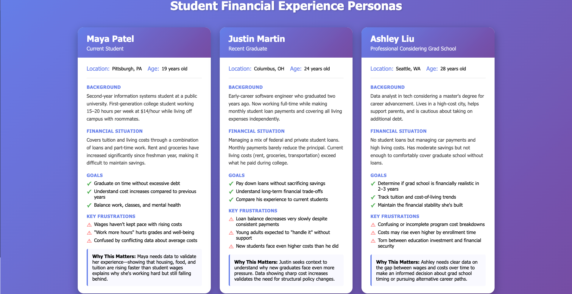
Personas
Understanding the perspectives of students and young professionals is essential to telling the story of rising costs and financial strain.
These personas represent the real challenges faced by current students, recent graduates, and early-career professionals as they navigate tuition, rent, groceries, and student loan burdens.
References
U.S. Bureau of Labor Statistics. (2024). Consumer Price Index (CPI) databases. U.S. Department of Labor. https://www.bls.gov/cpi/
U.S. Bureau of Labor Statistics. (2024). Food-at-home consumer price index, annual averages. U.S. Department of Labor. https://www.bls.gov/cpi/tables/home.htm
U.S. Bureau of Labor Statistics. (2024). Shelter and housing consumer price index, annual averages. U.S. Department of Labor. https://www.bls.gov/cpi/tables/shelter.htm
U.S. Bureau of Labor Statistics. (2024). Weekly earnings of wage and salary workers (ages 16–24). Current Population Survey. https://www.bls.gov/cps/
National Center for Education Statistics. (2024). Table 330.10: Average undergraduate tuition, fees, room, and board rates charged for full-time students in degree-granting postsecondary institutions. U.S. Department of Education. https://nces.ed.gov/programs/digest/
National Center for Education Statistics. (2024). Table 330.40: Average total cost of attendance for first-time, full-time students in degree-granting postsecondary institutions. U.S. Department of Education. https://nces.ed.gov/programs/digest/
Tableau Software. (2024). Tableau Desktop (Version 2024.x) [Computer software]. https://www.tableau.com/
Microsoft Corporation. (2024). Microsoft Copilot [AI productivity tool]. https://www.microsoft.com/en-us/microsoft-copilot
Grammarly, Inc. (2024). Grammarly [Writing assistance software]. https://www.grammarly.com/
AI acknowledgements
I used Grammarly to review my written work to verify that it was clear, grammatically correct, and tone consistent throughout. I used Chatgpt to organise my storyline, generate persona images and help me to brainstorm titles.